
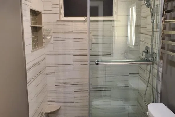
Matching grout vs. contrasting grout
A grout color close to the tile tone reads as one continuous surface — ideal for wood-look plank tile, marble-look floors, or any pattern you don't want interrupted. A contrasting grout, on the other hand, draws the eye to the tile's shape and layout, which works well with mosaic, subway, and geometric patterns.
The maintenance trade-off
Lighter grout shows dirt and grime faster, especially in kitchens and high-traffic floors; darker grout hides staining but can look chalky if a lighter grout was originally intended and later got dingy. We generally steer clients away from stark white grout on any floor that sees real foot traffic.
Test before you commit
Grout looks different wet, dry, and under different lighting than it does on a small sample card. We always recommend grouting a small test section, or at minimum viewing a full-size grout sample against your actual tile before the installer starts on the whole room.